Role
UX/UI Designer
Timeline
2025
Tools
Figma, Maze
Team
Individual project
Project Overview
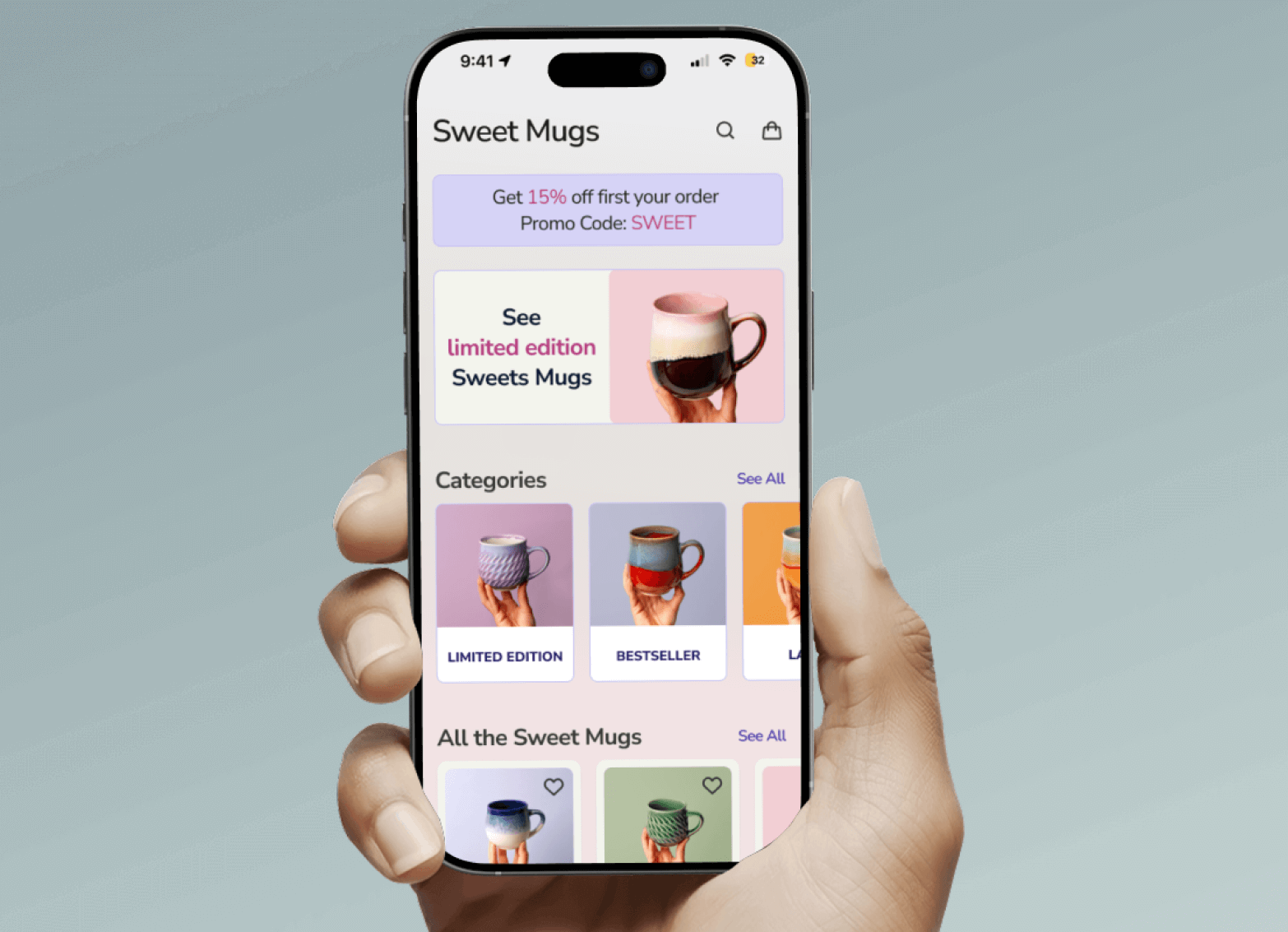
The Product — Sweet Mugs is an e-commerce mobile app that helps users easily search, browse, and explore product details to make informed and optionally sustainable shopping decisions. It offers an intuitive interface, smart search, and interactive elements like rewards, badges, and eco-scores to enhance engagement and promote mindful purchases.
Purpose — The Sweet Mugs app helps users quickly find, choose, and order hand-made and sustainable items.
The Goal — Design the Sweet Mugs app from conception to delivery, focusing on a seamless shopping experience, sustainable product discovery, and engaging gamification features.

Design Process
Empathize
Understand shopper motivations
- User story
- Inspiration
- Pain points
Define
Pin down the core problem
- Needs & expectations
- Deep analysis
- Scope
Ideate
Explore concepts and direction
- Mood board
- Design principles
- Concepts
Prototype
Give the ideas form
- Low-fi wireframes
- Design system
- Hi-fi screens
Test
Validate and refine
- Usability testing
- Maze
- Iteration
Design Timeline
A two-week sprint — research and definition in week one, design, refinement and handoff in week two.
Week 1
Research & definition
Understanding the user
Focus on the main points in the user story
Search for inspiration
Mood boards and competitor analysis
Define Needs & Expectations
Deep analysis of the user story
Week 2
Design, refinement & handoff
Starting the design
Core values, values' impact on users, iteration
Refining the design
Mockups, design system, hi-fi prototypes, accessibility
Going forward
Takeaways and next steps
Mood Board
The mood board for Sweet Mugs draws from warm, cozy aesthetics and a soft pastel palette — handcrafted textures, ceramic mugs, and cozy home settings. Pastel tones like blush pink, lavender, mint, and soft beige create a calm, inviting atmosphere. Combined with playful patterns and natural elements like wood and clay, the overall look evokes comfort, creativity, and artisanal charm.
Competitive Analysis
A range of ceramic and mug e-commerce experiences — plus inspirational Instagram accounts — were studied to understand conventions, strengths, and gaps in navigation, filtering and sorting, product-detail layouts, promotional patterns, and wishlist interactions.
User Story
“As an online shopper, I want to navigate an e-commerce application easily, search for products, and view their details so that I can make informed (and optionally sustainable) purchasing decisions. In addition, I want the app to have an interactive and engaging experience that includes gamification to incentivise me to engage with the platform.”
User Needs & Expectations
Navigate the app easily
Browse and filter mugs by category, price, color, material, and sustainability
Clear product information
View detailed information about the products
An interactive and engaging user experience
Color Palette
Primary
Lilac
#D6D3F6
Secondary
Mint
#D3F6E8
Tertiary
Pink
#F6D3E1
Design Principles
Be personal
It is a conversation with a friend, not a transaction with a brand.
Be playful
We believe shopping should feel like a small adventure.
Be transparent
We want people to trust what they buy and who they are buying from.
Be consistent
The interface is calm and predictable.
Be aesthetically pleasing
Our mugs are works of art, and the interface should be too.
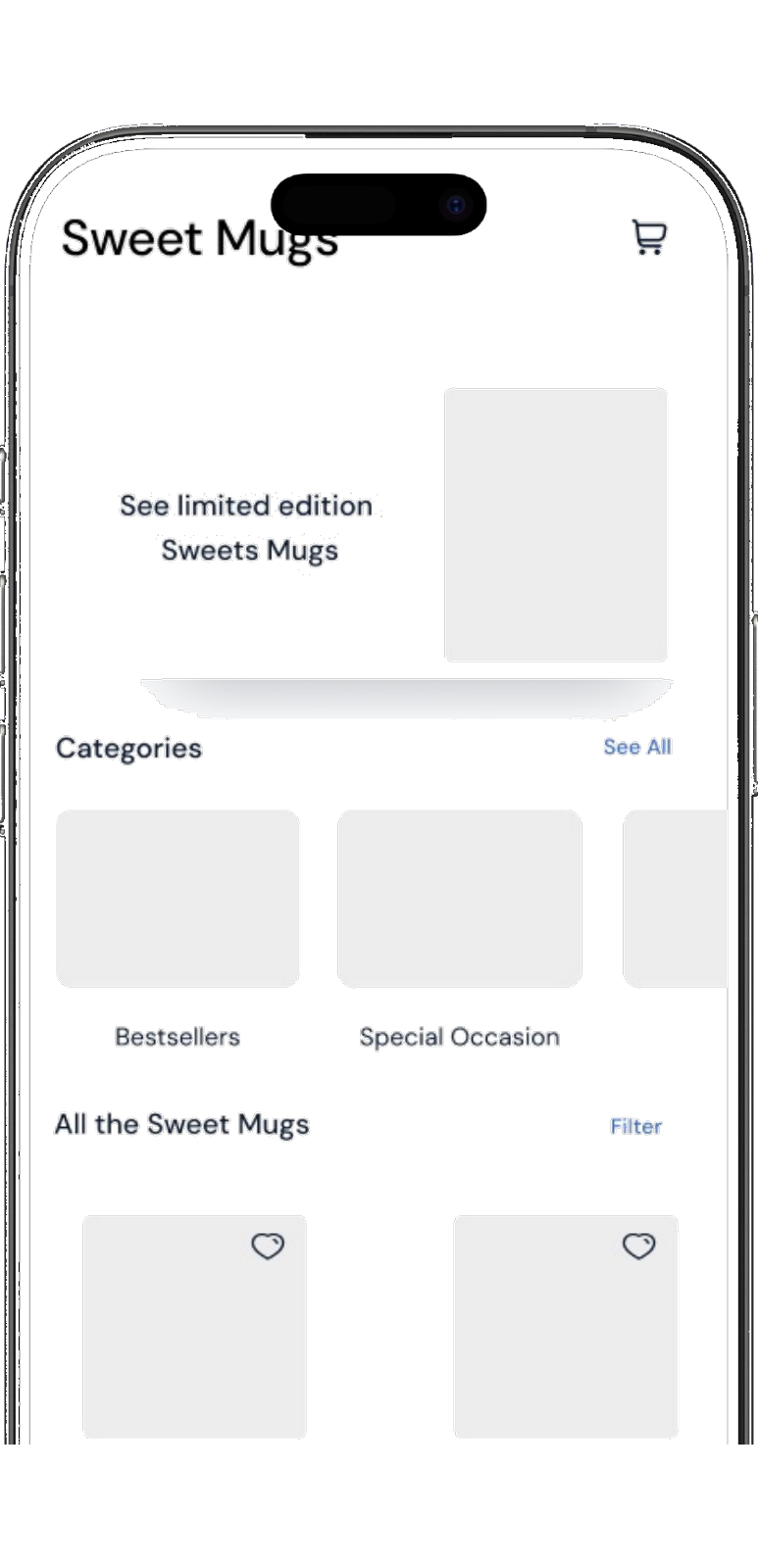
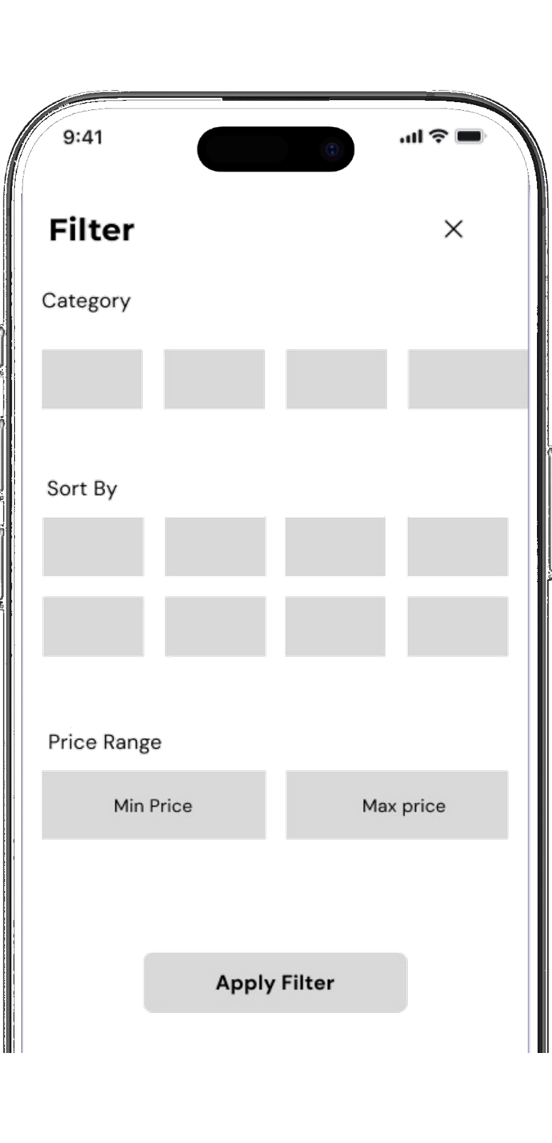
Low-fi Wireframes
Grayscale low-fidelity wireframes established layout and flow before visual design — focusing on the home storefront and the filter panel.
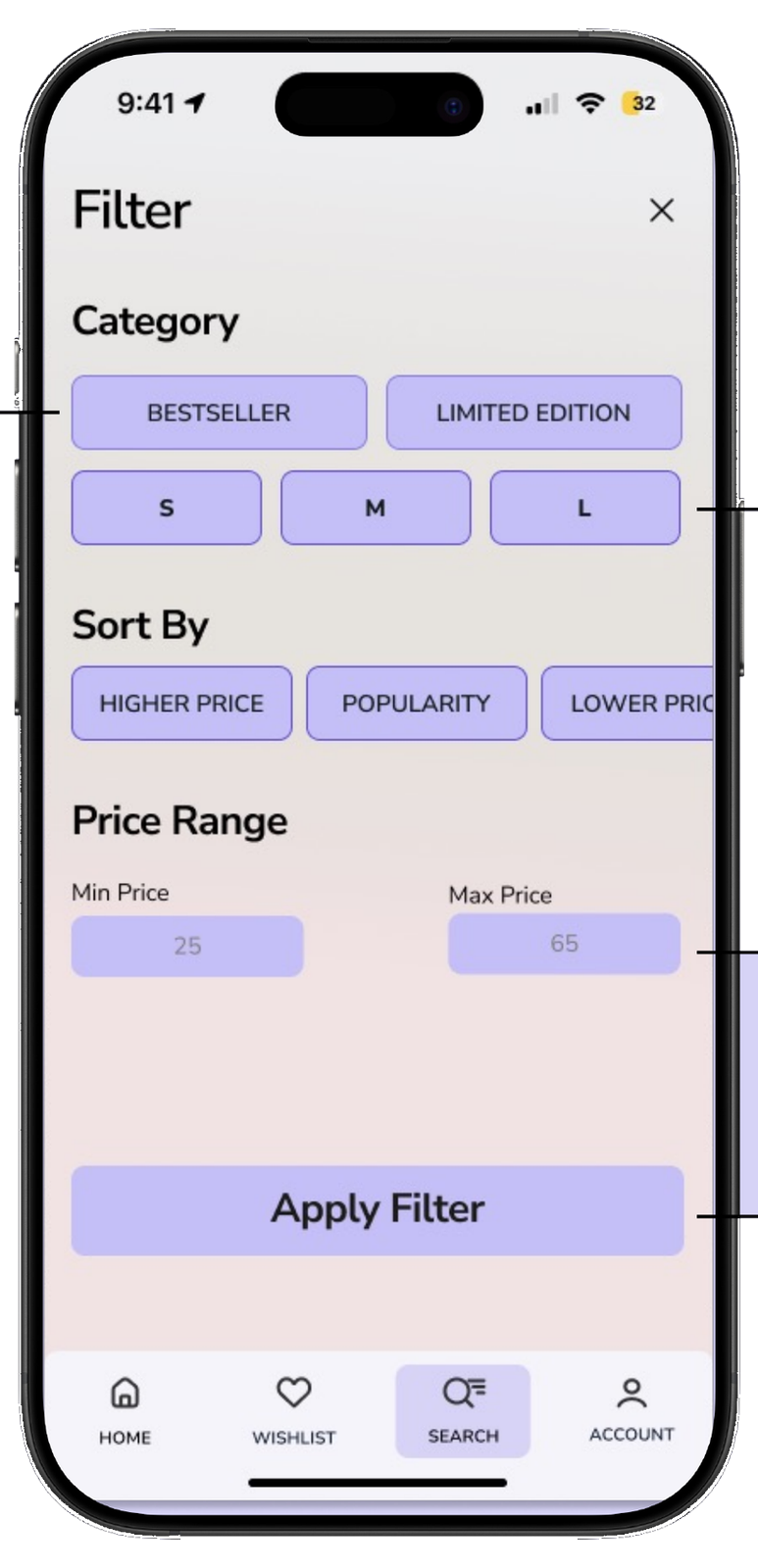
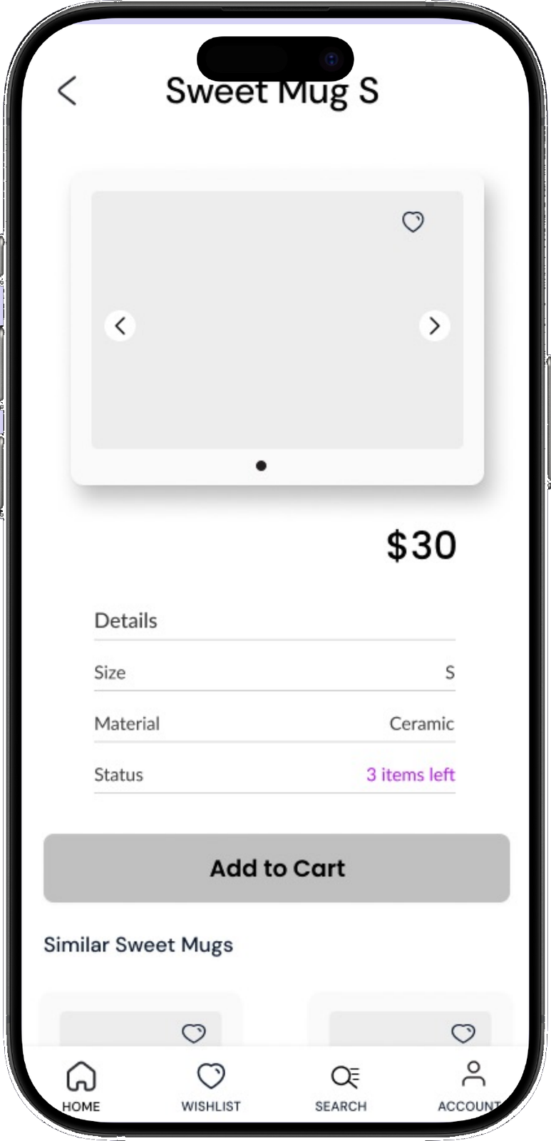
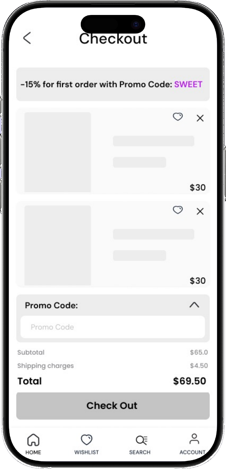
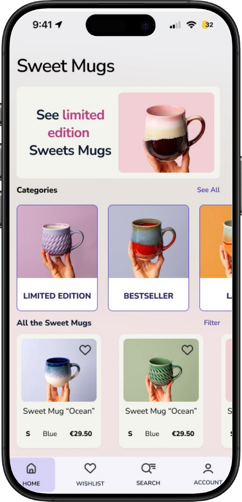
Hi-fi Prototypes
Usability Testing
Scenario — Shopping for a Unique Gift. You're browsing for something special to treat yourself, or as a surprise gift for someone you care about. You love items that feel personal, handmade, and meaningful. Imagine you're using a new online shop that sells beautiful hand-crafted ceramic mugs — you want to buy two mugs that catch your eye.
100%
task completion rate
7
participants on Maze
| Task | U1 | U2 | U3 | U4 | U5 | U6 | U7 |
|---|---|---|---|---|---|---|---|
| 1 Explore and check out the Blue Mug | |||||||
| 2 Add to Cart & Review | |||||||
| 3 Filter and find the Green Mug “Forest” | |||||||
| 4 Add the Green Mug “Forest” and apply the promo code | |||||||
| 5 Complete the checkout | |||||||
| Completion | 100% | 100% | 100% | 100% | 100% | 100% | 100% |
Usability testing was conducted with 7 participants on Maze, combining live and unmoderated sessions. Feedback from the story-driven tasks helped refine the wireframes while staying true to the original design.
Before / After Iteration
Usability testing drove a focused round of refinements to the home screen — surfacing a search icon and the promo code, and sharpening typography, layout, and visual hierarchy.
 Before
 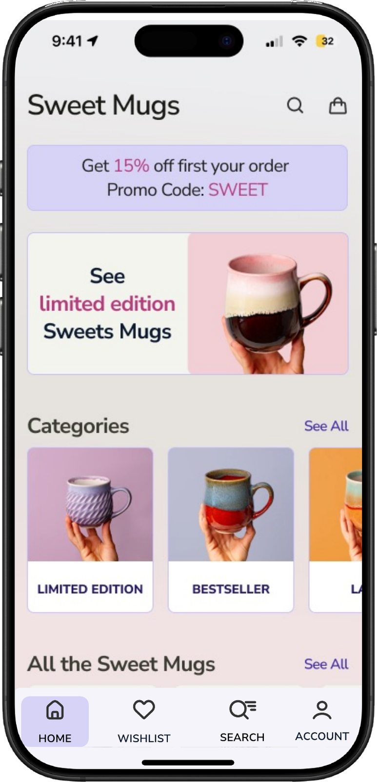 After
After Added a search icon at the top
Surfaced the promo code on the home page
Refined typography and spacing
Improved layout and alignment
Style and visual changes
Strengthened visual hierarchy (incl. a price-range slider)
Conclusion
Usability testing revealed the need for a top-right search icon, clearer filters, and a price-range slider. Users called the interface “clean” and “elegant,” aligning with the goal of a personal and visually appealing app.
Want the full case study?
Download the complete Sweet Mugs case study, including all screens, research, and iterations.
Download full case study (PDF)